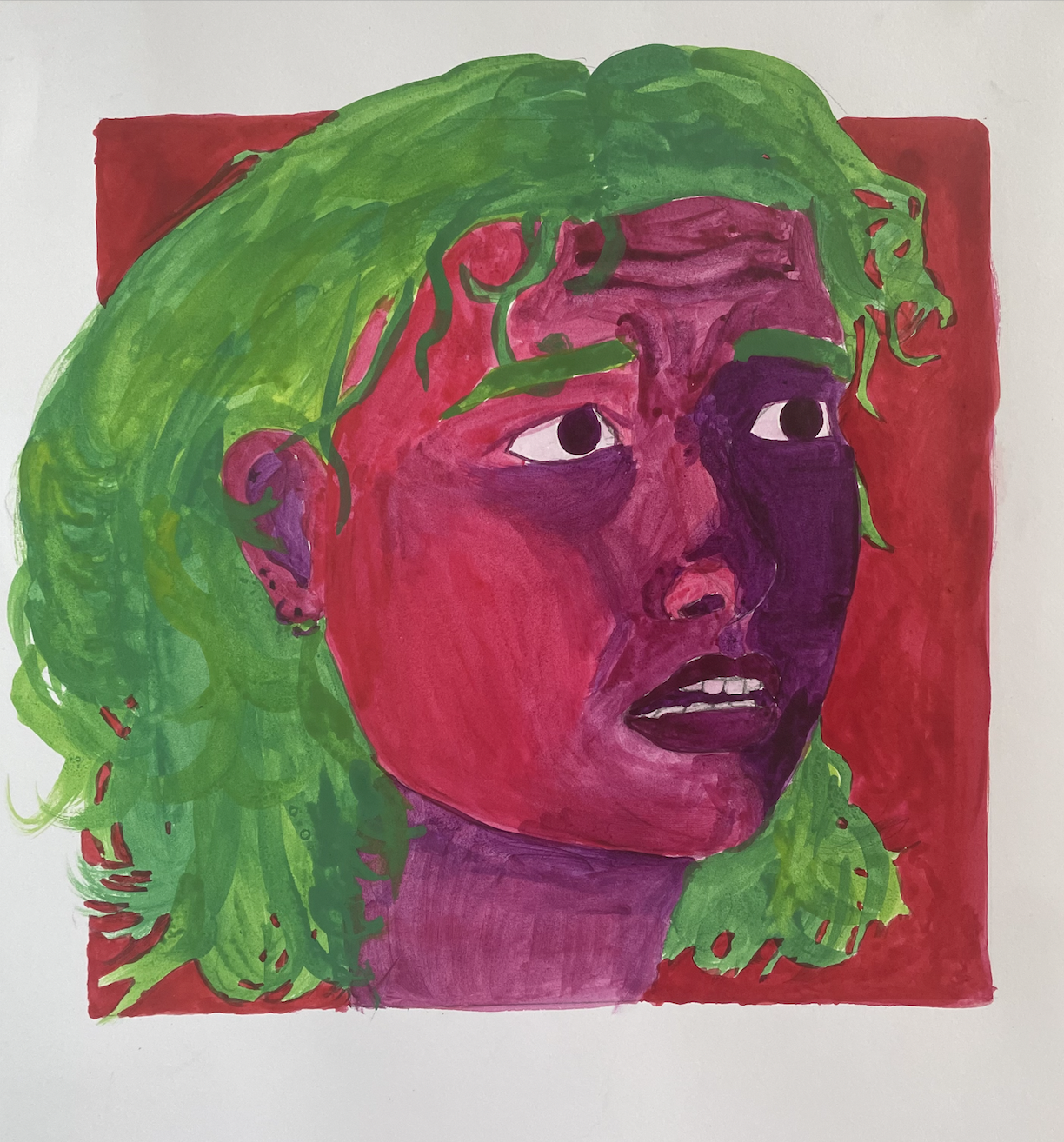
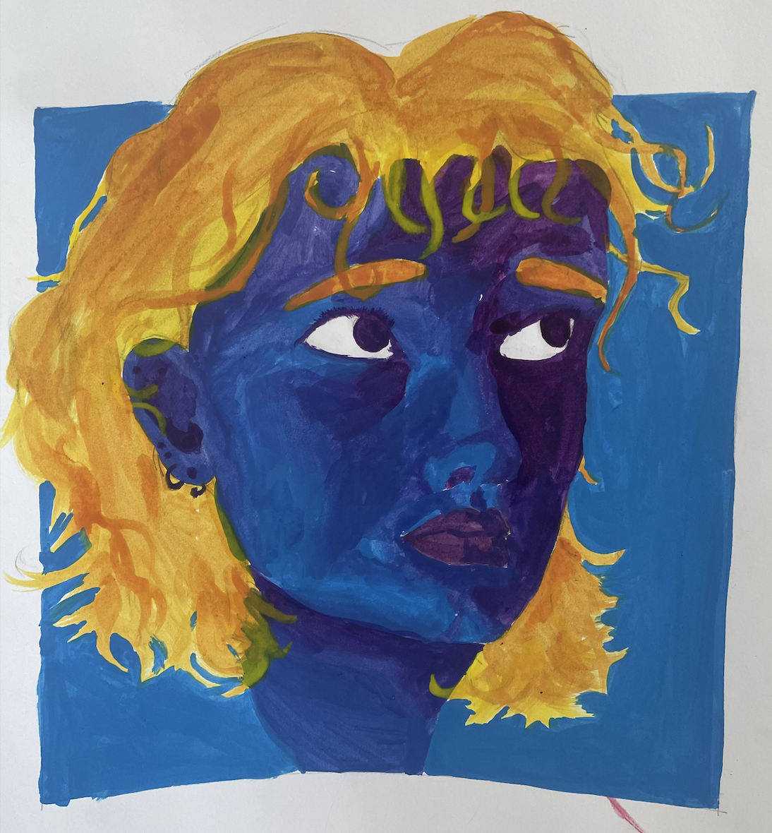
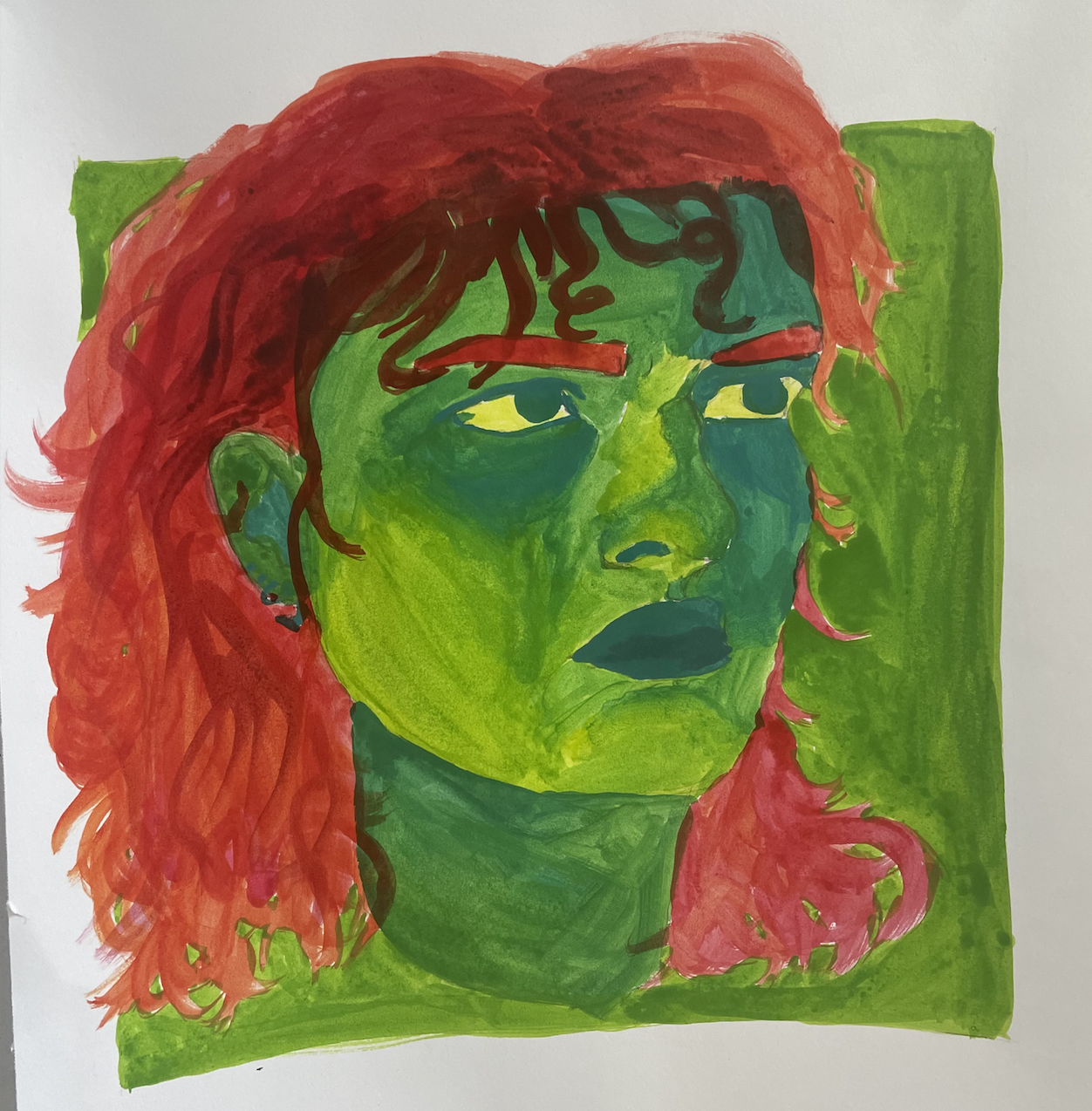
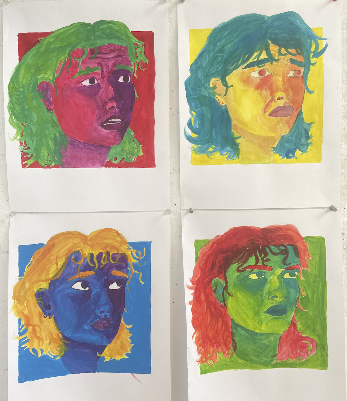
For my final project, I chose to do the theme of self-portraits. I have not really done any self-portraits before and I was interested in expanding my experience so I felt this was the best choice for me. I used analogous colors for the skin of the portraits and then used a mix of complementary colors for the hair. For my reference photos, I took them in the dark with a single white light to make sure there was enough contrast in the photos. Each portrait is also of a different facial expression. Some difficulty I faced was making the portraits actually look like me. I’ve found that self-portraits are more difficult than portraits of other people to me because I obviously know what I look like the most so it is easier to see what parts might not look like myself than other people. I think if I started over I would probably re-do my first painting as I just do not feel that it looks like me and it is probably my least favorite one.
I am planning on doing the self-portrait option. I have taken photos and plan to use harsh contrast lighting and use different color palettes for each portrait. Some of the color palettes I might do are cool colors, warm colors, primary colors, or monochromatic colors.
I have never had the opportunity to set up my own still life when drawing from life before so I was very excited about what I would do and choose my subject for this project. I had seen how a few of my classmates had drawn from the skeleton for our last assignment and I thought that drawing from the animal skull could be an interesting challenge for me. I came in one night and set up the skull, black drape, and sheer fabric and took many photographs from different angles. I am very proud of how the skull came out and feel it is a great improvement from my last project. One challenge I faced was that I was unsure how I would draw the white fabric to look semi-transparent. I used charcoal sticks and pencils for the skull, background, and black fabric, but decided to use a graphite stick for the white fabric. I have not used graphite before this project so I was somewhat apprehensive however I am content with how it turned out and the lighter shade of the graphite really helped to give the illusion that the white fabric is actually mesh. I was also debating whether or not to fill in the background of the drawing with all black because I was worried that the black fabric would fall back and blend in but I am glad that I did include the background because it makes the skull and fabrics pop.
My approach to the assignment was to start with materials I was familiar with, such as charcoal and ebony. I did this because I have not taken an art class since my senior year of high school and wanted to slowly introduce myself back into it with familiar tactics. I then moved on to materials I was less familiar with like the Conte crayon and graphite stick. I have used graphite before but never in the form we use in class. I did not like the graphite stick as much as the other materials as I felt it was hard to get any lights and my drawing ended up mainly with medium and dark tones which I did not want. I think my bottom left drawing is my most successful because I think I did a good job filling the page and I am especially proud of the clear bottle as it looks see-through. I also do not often work with metallic materials so I felt as though I did a good job at making the metal part actually look metal. My least favorite would have to be the top left one. It was my first drawing, and I had not drawn in quite a while and I was still getting back into the hang of things. I also feel as though I could have added more to the background as it looks very empty and there is too much negative space.